Close
GET 20% OFF
By subscribing to our newsletter
Pretty in pink: Sancal blushes at Campari Canada by I-V
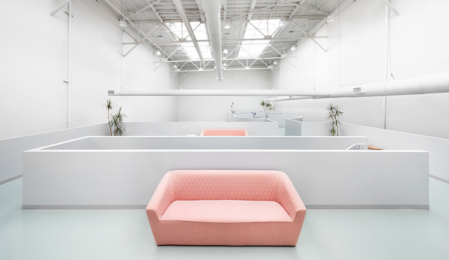 Canadian studio I-V has created a tasty design for Campari Canada’s new Toronto office. Inspired by Campari posters and ingredients, the pastel-coloured workplace pays homage to Italian design.
Gruppo Campari, which produces the famous 150-year-old Italian beverage along with a portfolio of other spirits, wines and soft drinks, acquired the Forty Creek Whisky distillery in Grimsby, Ontario, in 2014. The group has since established its North American presence further with a workspace in what used to be a film studio, and a foundry prior to that.
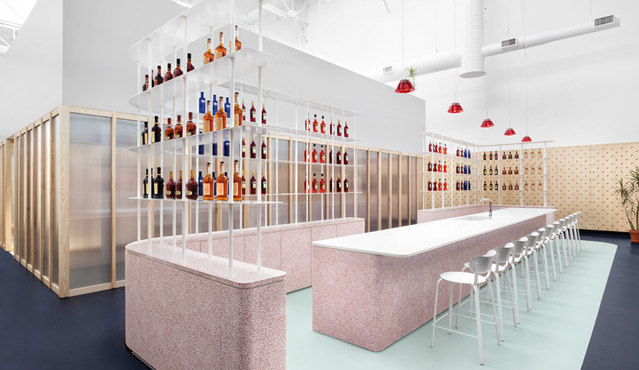 Campari Canada requested a space that would capture the spirit of the company and inspire the people who worked for it. The I-V design team, lead by Emil Teleki, began by researching the client’s history, and looked to its iconic advertising posters by Italian designers and artists, such as futurists Fortunato Depero and Bruno Munari, as well as the ingredients that go into Campari’s secret recipe, which only a handful of people know. “We abstracted colours, patterns, textures and shapes from both posters and ingredients, and layered them until we achieved a balanced 3D canvas,” Teleki explains.
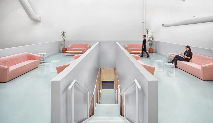 The interior scheme emphasises colour and materials, and it is both refined and precise while being whimsical and fun. The 890-square-metre space provides custom-made workstations and informal and formal meeting rooms on the lower level, and a flexible open space and tasting bar on the mezzanine.
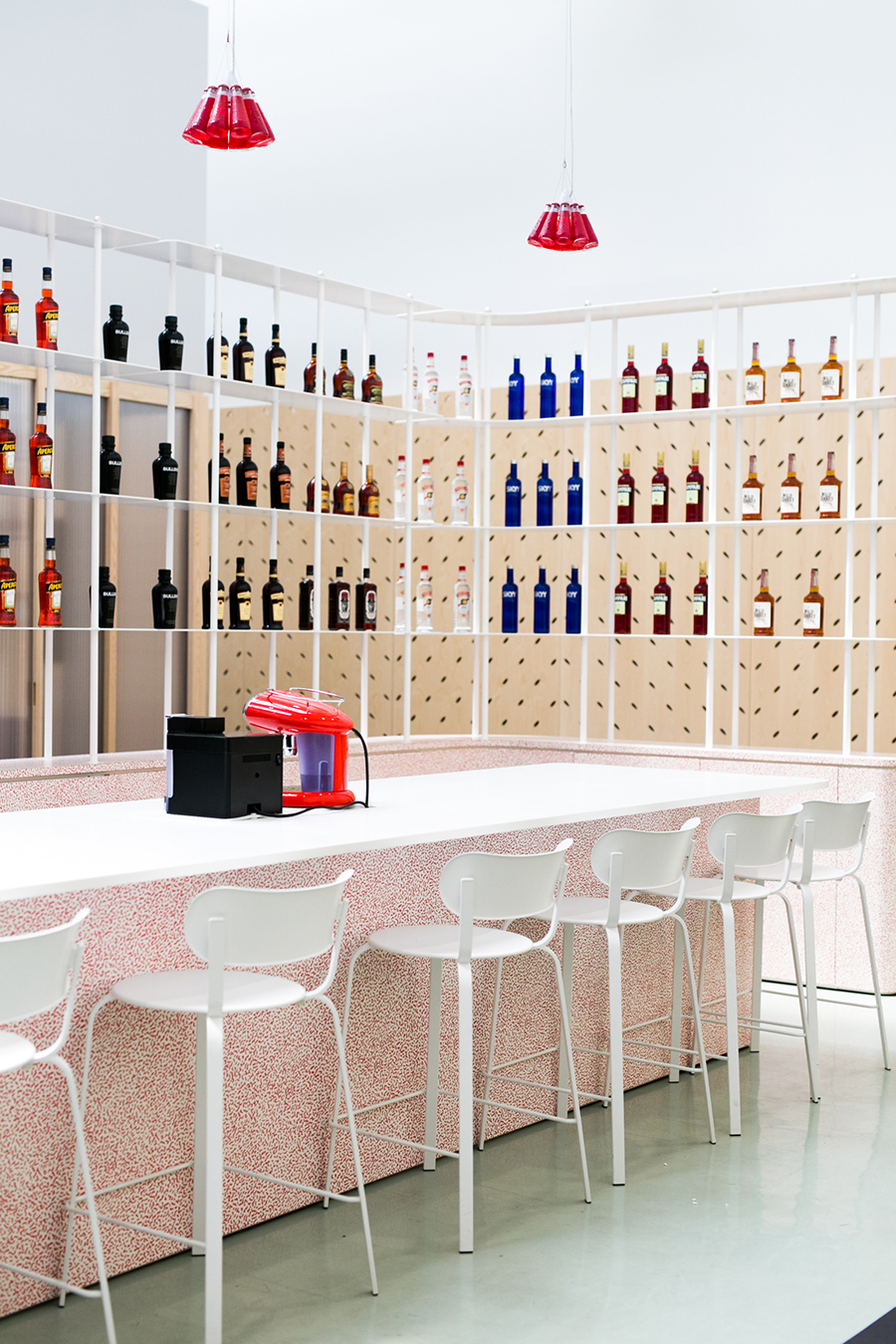 Colourful rubber flooring defines each space, with pale green indicating functional areas and dark blue marking circulation zones. The 5-metre-long tasting bar is clad in the confetti-patterned laminate Bacterio, which Memphis Group founder Ettore Sottsass designed in 1978. Ingo Maurer’s Campari Lights, designed by Raffaele Celentano in 2002, are suspended above the bar; each pendant comprising ten Campari Soda bottles. “The transition from brand to space was quite fluid and organic, because we filtered our decisions through the lens of bold, vibrant and experimental design,” says Teleki.
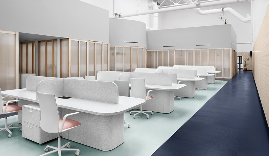 The design team’s playful approach to the predominantly pastel colour palette is also seen in the peachy-pink Tea Sofas that stand out from the pale green flooring and light grey walls on the mezzanine level. Tea Sofa, designed by Estudihac for Sancal, demonstrates the Spanish manufacturer’s fresh and functional approach to furniture, blending elegance, practicality and playfulness. Inspired by British design (hence the name), the Tea collection features solid forms with blunt lines, concealed legs and hexagonal-quilted upholstery.
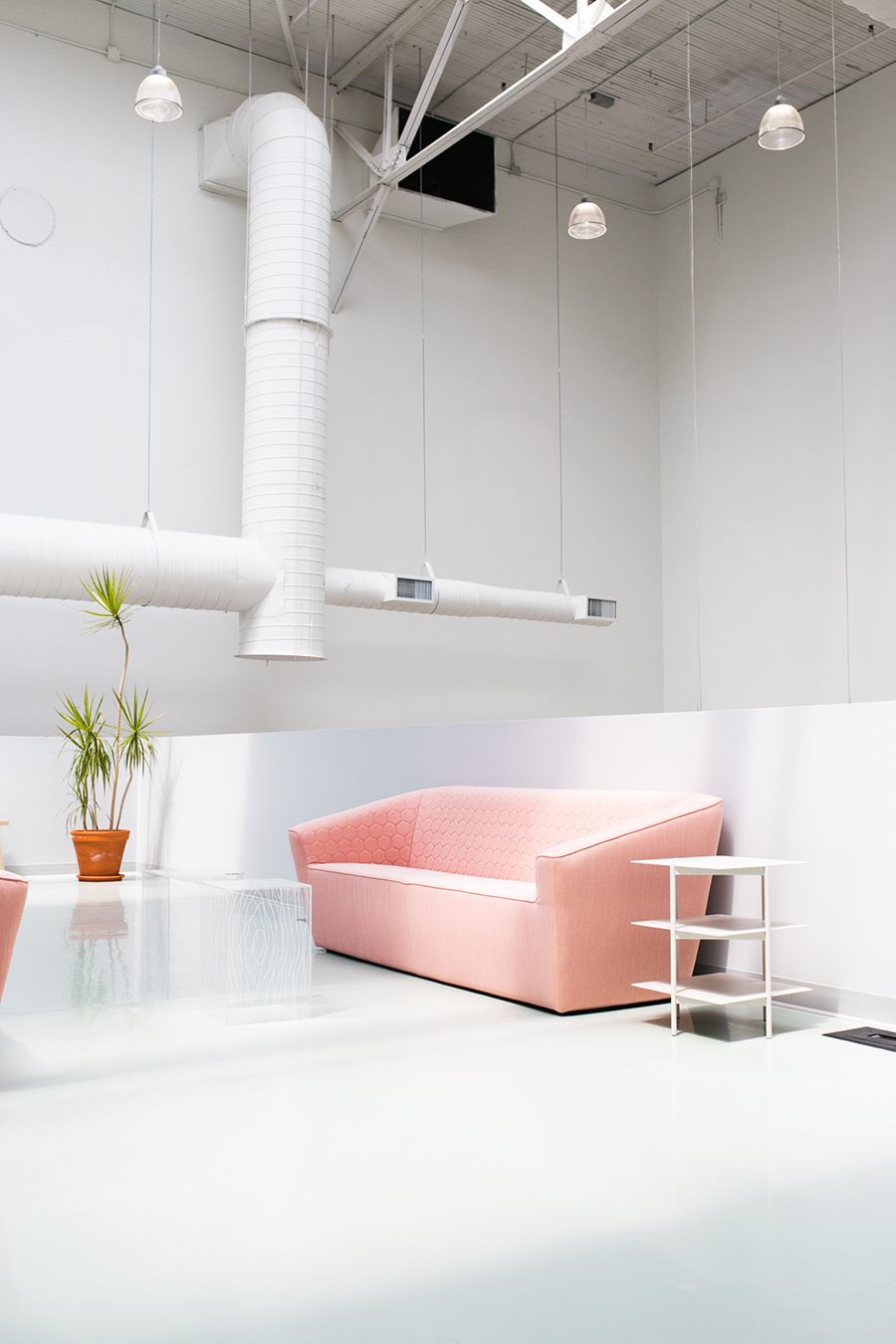 For more information about the Tea collection by Sancal, drop by the KE-ZU showroom at Alexandria or view the product online.
Search
Archives
- 2020
- 2019
- 2018
- 2017
- 2016
- 2015
- 2014
- 2013
- 2012
- 2011
- 2010
- 2009
My Wish List

